With over 60% of Google’s search traffic now coming from mobile phones there’s a really good chance that a lot of the people viewing your website will be using a small screen.
This means you need to ensure that your website looks and functions really smoothly on any mobile phone.
Why do I need to check my website on different mobile phones?
Different phones have different screen sizes.
If you watch the video above, the example shows a page being displayed on an iPhone 6/7/8 and 6/7/8 Plus.
Because the Plus has a different size screen you can see that the web page looks a little different.
You need to ensure your website looks great on different screen sizes.
How do I check my web pages on different mobile phones?
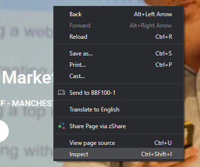
Every main stream web browser like Google Chrome, Firefox, Microsoft Edge and Safari has a right click menu option called something like “Inspect” or “Inspect Element”.

Click on it and you will open what are called “Developer Tools”.
Within the Developer Tools window you’ll see a small mobile phone style icon.
![]()
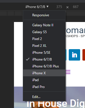
When you click this you’ll be able to see what your website looks like on a mobile phone.
To change the type of phone just click on the drop down box top centre of the screen and you can switch from a Samsung phone to an iPhone really quickly.

Check out the video at the top of this page to see how it’s done.
Conclusion
Whenever you create a new blog post, landing or product page for your website make sure you quickly check it looks OK on a mobile phone.
Can the various elements that make up your page been seen and tapped on?
Make sure you fill in forms and buy things from yourself just to be certain the experience your visitors are getting is top-notch.
If you need some help building better performing web pages then check out my Search Engine Optimisation training which is also available on demand and my Content Marketing Session. Both can help you make your website better.
On Demand, Online SEO Training
Designed for Marketeers, website editors & owners.
