
Hate is probably a strong word to use but we spend so much time online during our work and personal lives that when we come across an awful website we really do hate it for wasting our time.
Here’s five reasons why people will quickly surf away from your website and never return.
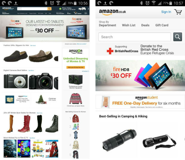
 Many recent surveys I’ve read have said that over 50% of Business to Consumer (B2C) web visitors are viewing pages on mobile phones and in the Business to Business (B2B) sector mobile usage is also increasing. A year ago this website, which is B2B, had around 8% mobile users, now it’s 22%.
Mobile usage is very much on the increase so you need to be mobile friendly.
What does mobile friendly really mean?
Your website should be designed so that it fits different screen sizes correctly and you don’t have to pinch-to-zoom with your fingers to read text and click on things. This type of design is usually called Responsive.
Mobile friendly also means having a navigation menu that when clicked on stays open and contact pages/shopping carts have forms with big enough text fields to stick our fingers in.
Here’s a couple of examples. The first is the Amazon UK home page desktop version on a mobile phone and the second is the same page but mobile friendly.
Many recent surveys I’ve read have said that over 50% of Business to Consumer (B2C) web visitors are viewing pages on mobile phones and in the Business to Business (B2B) sector mobile usage is also increasing. A year ago this website, which is B2B, had around 8% mobile users, now it’s 22%.
Mobile usage is very much on the increase so you need to be mobile friendly.
What does mobile friendly really mean?
Your website should be designed so that it fits different screen sizes correctly and you don’t have to pinch-to-zoom with your fingers to read text and click on things. This type of design is usually called Responsive.
Mobile friendly also means having a navigation menu that when clicked on stays open and contact pages/shopping carts have forms with big enough text fields to stick our fingers in.
Here’s a couple of examples. The first is the Amazon UK home page desktop version on a mobile phone and the second is the same page but mobile friendly.
 Making sure your website is super quick is really important. Google even ranks you on how fast your site is and gives you a little boost in the search results if you’re nice and quick.
From the web visitors point of view we want our content quickly so no Flash, no HUGE images and don’t include lots of widgets that will slow things down.
Remember it may not be your website slowing things up, it could be an embedded service that you use so make sure you do as much as you can on your own website.
Google has a really useful tool that measures your website speed on desktop and mobile and gives you lots of advice on how to improve things. Try it out.
Making sure your website is super quick is really important. Google even ranks you on how fast your site is and gives you a little boost in the search results if you’re nice and quick.
From the web visitors point of view we want our content quickly so no Flash, no HUGE images and don’t include lots of widgets that will slow things down.
Remember it may not be your website slowing things up, it could be an embedded service that you use so make sure you do as much as you can on your own website.
Google has a really useful tool that measures your website speed on desktop and mobile and gives you lots of advice on how to improve things. Try it out.
Not Mobile Friendly
Many recent surveys I’ve read have said that over 50% of Business to Consumer (B2C) web visitors are viewing pages on mobile phones and in the Business to Business (B2B) sector mobile usage is also increasing. A year ago this website, which is B2B, had around 8% mobile users, now it’s 22%.
Mobile usage is very much on the increase so you need to be mobile friendly.
What does mobile friendly really mean?
Your website should be designed so that it fits different screen sizes correctly and you don’t have to pinch-to-zoom with your fingers to read text and click on things. This type of design is usually called Responsive.
Mobile friendly also means having a navigation menu that when clicked on stays open and contact pages/shopping carts have forms with big enough text fields to stick our fingers in.
Here’s a couple of examples. The first is the Amazon UK home page desktop version on a mobile phone and the second is the same page but mobile friendly.
Slim Content
You wouldn’t open a bricks and mortar store with huge gaps on your shelves so you shouldn’t launch a website with virtually no content. It’s always to good idea to have at least 400 – 600 words on a page and over 1000 on a blog post but in practice this isn’t always possible so make sure your content arrives in different formats. For example, you don’t want a 500 word product description on your ecommerce store but using 150 words of text, a short video, a social media recommendation and a few reviews can help create a meaningful page that offers information and value to your user. Always remember that content doesn’t have to be all text, although it’s a good idea to use plenty. Content can be embedded slides from SlideShare, video from YouTube, Infographics or embedded Tweets. Content is the stuff that answers your clients questions, puts them at ease and helps them make the step from browsing to buying.Hoop Jumping
Give the people what they want and make it easy for them. I visit so many websites that make life difficult to consume the content. It’s could be interruption marketing with lots of pop up windows asking questions, it could be a full screen advert or some box asking me if I want to download an app….. I really hate this, it drives me mad. We hated pop up windows in the 90’s and just because they look pretty now doesn’t mean we like them so make sure you get rid of the darn things….. just give people what they want. If you want someone to sign up to your mailing list then build the form or call to action into the page instead of waiting until someone has scrolled down the page and open a bloody great pop up when they’re half way through a sentence!!! It really gets on my nerves. I’ll stop there. I’m using more than one exclamation mark and can feel a rant coming on…. don’t make people jump through hoops & click on stuff just to read your page.Very Slow Website
Making sure your website is super quick is really important. Google even ranks you on how fast your site is and gives you a little boost in the search results if you’re nice and quick.
From the web visitors point of view we want our content quickly so no Flash, no HUGE images and don’t include lots of widgets that will slow things down.
Remember it may not be your website slowing things up, it could be an embedded service that you use so make sure you do as much as you can on your own website.
Google has a really useful tool that measures your website speed on desktop and mobile and gives you lots of advice on how to improve things. Try it out.